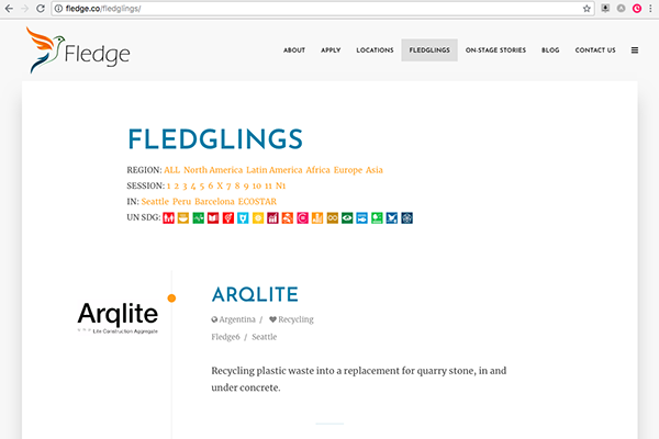
It’s a good idea to look at your website every few years, look to see if it’s starting to feel dated, if its missing the look-and-feel of the latest websites.
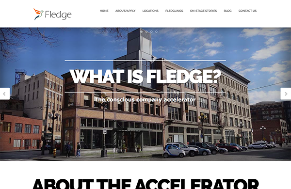
Last week’s Fledge website had a nice front page, but it wasn’t rendering well on smartphones and the overall structure needed a refresh to handle accelerators for both startups and co-ops, as well as handling programs in seven cities.
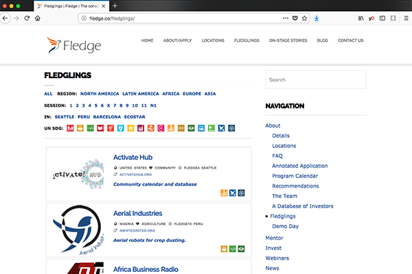
And with 81 graduates and counting, the ability to view the fledglings is even more important than ever, and the previous layout was using 1/3 of the screen for navigation. Plus it was cutting off most of the fledgling’s logos and it didn’t have enough space for meaningful descriptions.
The new layout not only fixes those issues, but on the detail page highlights the logos as part of the “cover page”.
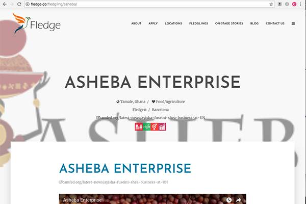 In addition to the aesthetic changes, going through the process of updating a website also lets you review how you are describing your business to the world. Over time all the little changes add up, for example, what once was the conscious company accelerator turns into a global network of conscious company accelerators.
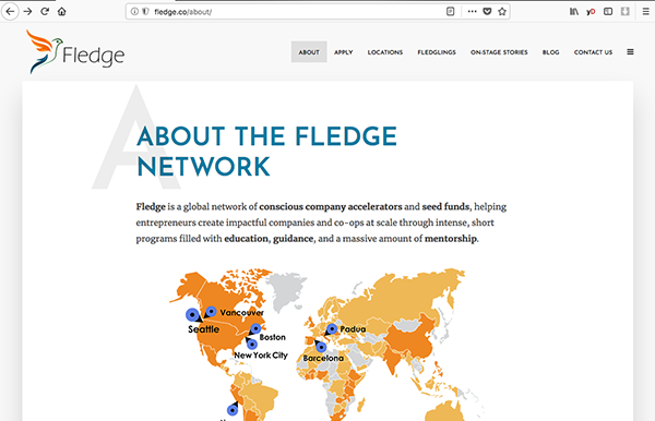 What once upon a time was a simple company operating in one city is a multi-national organization with far more stakeholders, all of whom need to be represented within a single website.
When was the last time you read through your own website?

