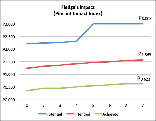
One of the biggest challenges of impact investing is in measuring the impact of the investments. One would think that this would be an easy, solved problem, but it is far from simple. The impact ecosystem is still working through multiple methods of measurements, few of which provide a single value which can be summed, compared, and tracked over time.
The Pinchot Impact Index is one proposed method which does sum up to a value. Or more specifically, it can measure the potential, intended, and achieved impacts within a portfolio.
- Potential impact is analogous to the total addressable market. How big is the whole problem, globally?
- Intended impact is analogous to the reachable market, the size of the solution the company itself is likely to reach.
- Achieved impact is then the percentage of the intended impact actually completed.
The book explaining the Pinchot Impact Index runs through the Fledge portfolio as of mid-2015, estimating these three values. Since then, the values have been computed following the completion of each of the first seven sessions, and estimating the results from the upcoming eighth session.

The result of that effort is the graph above, showing the trends over the last four years. (For those new to Fledge, “X” was an experimental all-online session in late 2015. 7 is the upcoming Spring 2016 session).
The big jump in potential impact in Fledge5 is all Evrnu, which is making cotton a recyclable resource. That too explains the flatline in Fledge6, FledgeX, and Fledge7, as the Pinchot Index is a logarithmic scale, and thus that huge potential impact dwarfs everything else.
More exciting is to see the slow but steady rise in intended and achieved impacts.
For those of you outside the industry, or for those of you focused on a single company, this may seem trivial, tracking a KPI in a graph, but this is one of the first (if not the first-ever) trendlines of impact across a portfolio of impactful startups.
And it is truly tracking progress, as the slight ups and downs include the drops from the fledglings which have failed to take flight, as well as the new additions from each new session.
Next up, to see the green Achieved line cross above P1, and hopefully to find some more Potential P3’s to keep the blue line moving upward too.


